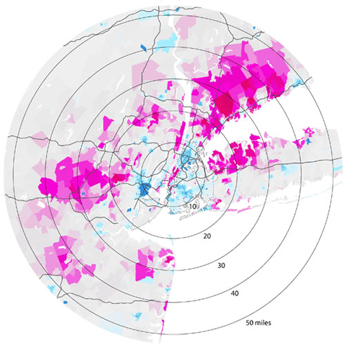
 After reading Marxist geographer Neil Smith's The New Urban Frontier (here's video of his talk at the Walker on globalization a few years ago), the title of the website Radical Cartography is enough to pique my interest, but this analysis of the "doughnut effect" of wealth distribution seals the deal. Plotting out wealth suggests that the concentric circles demographers speak of only appear in older cities; newer ones, like my own town of Minneapolis, have "wedges of wealth occupying a continuous pie-slice from the center to the periphery" and that poverty donuts almost universally have a five-mile radius, perhaps the distance the poor can travel without a car. (In these representations, pink is wealth, blue is poverty.) Above, New York City's wealth distribution.
Also: When'd it get so expensive to be poor? Barbara Ehrenreich explores the costly side of poverty.
Via Gothamist.
No comments:
Post a Comment