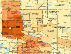
Census mapping: Social Explorer is a website I just found that presents 2000 US census data—race, poverty, country of origin for non-natives, unemployment—in a searchable, zoomable map format. In this screen-capture, the brownest areas show higher levels of poverty of
my fair town (which is curious but unsurprising: log on to see the correlation between the brown patches of poverty and the brown patches of race). Speaking of which,
The Observer reported on Sunday that
one third of all deaths—around 18 million a year, globally—are caused by poverty.
No comments:
Post a Comment