 The Raw Story
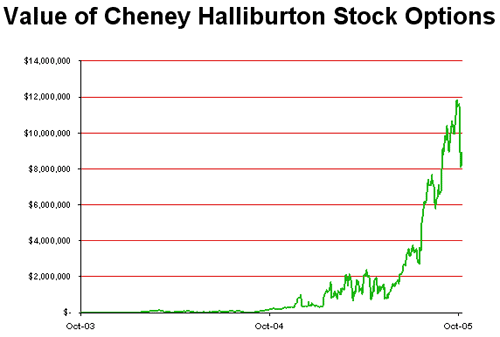
 reports that VP Dick Cheney continues to get rich off of war and disaster: his stock options in Halliburton, valued at $241,498 a year ago, are
now worth more than $8 million. While Cheney's former company keeps gettting
no-bid contract after
no-bid contract (after
no-bid contract) from the US Government, the second-in-command still holds on to 433,333 shares of its stock. Prompting Sen. Frank Lautenberg (D-NJ) to say, "What the fuck?" I'm paraphrasing. What he literally said was:
Halliburton has already raked in more than $10 billion from the Bush-Cheney Administration for work in Iraq, and they were awarded some of the first Katrina contracts. It is unseemly for the Vice President to continue to benefit from this company at the same time his Administration funnels billions of dollars to it. The Vice President should sever his financial ties to Halliburton once and for all.
Halliburton Watch offers some corresponding data charts:

 The Raw Story reports that VP Dick Cheney continues to get rich off of war and disaster: his stock options in Halliburton, valued at $241,498 a year ago, are now worth more than $8 million. While Cheney's former company keeps gettting no-bid contract after no-bid contract (after no-bid contract) from the US Government, the second-in-command still holds on to 433,333 shares of its stock. Prompting Sen. Frank Lautenberg (D-NJ) to say, "What the fuck?" I'm paraphrasing. What he literally said was:
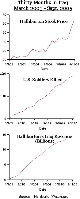

6 comments:
I've heard that one reason Halliburton gets all those no-bid contracts is because there's no other company with nearly as much manpower that does what they do. Not to say that the Veep isn't a douche, but I don't think it's all corruption-driven.
Also, the Y-axes seem to be subjectively chosen for those graphs.
Also, the Y-axes seem to be subjectively chosen for those graphs.
How so? With one exception, all the Y-axes start at zero.
By the Y-axes being subjectively chosen, I mean that the slopes of the three graphs seem to line up quite well, despite them being measurements of completely different things. Maybe if they were all measured in percentage of change or some universal thing like that. I suppose I wouldn't even have a problem with these graphs if they weren't put right next to each other as if to signify that Halliburton making a profit has a causal relationship with dead soldiers.
By the Y-axes being subjectively chosen, I mean that the slopes of the three graphs seem to line up quite well, despite them being measurements of completely different things.... put right next to each other as if to signify that Halliburton making a profit has a causal relationship with dead soldiers.
That's the whole point of the article, that these things aren't unrelated. Common sense dictates that if you're a DoD supplier, your income and dead soldiers are likely to track fairly well. Common sense isn't proof positive, though, so here are some graphs to support the correlation.
And I still don't understand what you think is subjective about the Y-axes on the graphs. To use the specific issues you mentioned, profit and dead soldiers, both of those Y-axes start at zero and end at the most recent y-values. Zero is the most natural place to start any graph axis, and including all figures, up to and including the most recent figures seems straightforward, too. What's subjective here?
I never considered the final value as being the determiner of the height of the chart. I think that solves my dilemma.
Don't get me wrong, I think Halliburton is a bunch of douchebags, and I know there's a correlation. It just seemed to fit too well, but I guess it's just a coincidence that the slopes are so similar.
Post a Comment